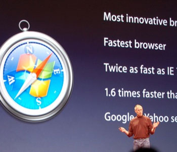
The word is out. The next major release of Apple’s web browser Safari–version 3–is upcoming, and a public beta has been made available for download. And an even bigger news is that there is now a version available for Windows! I think we had this coming. Ever since Apple switched over to the dark side (Intel, that is!), theoretically most (if not all) of their software can be run on Intel-compatible PCs.
I’m actually surprised it took Apple this long to release Apple for Windows. I’m of the opinion that the next software wars will not be fought on the desktop, but online–on the browser. And while the browser used doesn’t matter as much as the applications/sites it’s being used on, it still pays to have a hold over part of the market.
At any rate, much has been said about the high points and low points of Safari, particularly the Windows port. Ia recently reviewed it here, and gave it a dismal 0.5 rating (meaning it’s more or less neutral, leaning a bit to the positive side). There have been a lot more reviews on the blogosphere, but here’s one thing in common that I see: Windows users are very bothered by the on-screen font rendering.
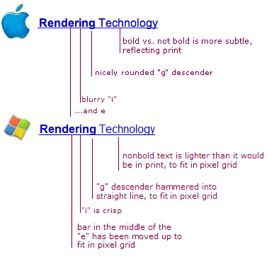
People say it’s horrible. It’s blurry and it’s not crisp at all. The typeface also looks fatter than usual, and occupies more space than it should.

Image from joelonsoftware.com.
Okay, coming from the tech agnostic (really?) camp, meaning one who uses Windows and OS X side by side on a day-to-day basis (sometimes simultaneously navigating both laptops with both hands), I can say the difference is there, but it shouldn’t be such a big deal. For one, I’ve always known the Mac to render typefaces beautifully and as if faithful to the written/printed word. Windows, meanwhile, has focused more on the screen.
Joel Spolsky writes an excellent analysis here. He writes that this difference stemmed from Apple’s roots in desktop publishing. Microsoft’s approach is more pragmatic, though.
The difference originates from Apple’s legacy in desktop publishing and graphic design. The nice thing about the Apple algorithm is that you can lay out a page of text for print, and on screen, you get a nice approximation of the finished product. This is especially significant when you consider how dark a block of text looks. Microsoft’s mechanism of hammering fonts into pixels means that they don’t really mind using thinner lines to eliminate blurry edges, even though this makes the entire paragraph lighter than it would be in print.
But in the end, it’s psychology that will be the real deal breaker. Joel sums it up here.
… Apple users liked Apple’s system, while Windows users liked Microsoft’s system. This is not just standard fanboyism; it reflects the fact that when you ask people to choose a style or design that they prefer, unless they are trained, they will generally choose the one that looks most familiar. In most matters of taste, when you do preference surveys, you’ll find that most people don’t really know what to choose, and will opt for the one that seems most familiar. This goes for anything from silverware (people pick out the patterns that match the silverware they had growing up) to typefaces to graphic design: unless people are trained to know what to look for, they’re going to pick the one that is most familiar.
It’s not a question of which is better. It’s a matter of which you are used to, and which you would rather stick with. So this means Safari’s font rendering is not weird and wrong. It’s meant to be that way; there is a reason.
Now I was thinking designers and web publishers would have one reason to celebrate–they no longer need to buy new hardware (Macs) just to test browser compatibility. I for one, have found Safari to be helpful in weeding out inconsistencies in coding and design work (e.g,. missing/misplaced closing DIV tags. Damn those DIV tags).


 This is something Windows lovers would find interesting (I for one, do use Windows from time to time, but I prefer to use my Mac for day to day work).
 I’m a long time Windows user. Honestly, I think geeky-geeks, whether they admit it or not, are like me. They’ve always used a combo of Linux and Windows. Macs? Well, Macs are notoriously the machine for the
  Holy smokes! This is groundbreaking news. And it isn’t even April 1st anymore (otherwise, no one would take it seriously). Apple will now let you install Windows XP on your Intel-based Mac.