Amidst all the cries of ecstasy over Mac OS X Leopard at the WWDC07, we have a little surpsrise: Safari is released for Windows. It’s a public beta, to be exact.
That’s great news, coming not from someone who wants Apple to take over the world, but as a web designer who wants to test web pages in all kinds of browsers. I haven’t been able to do that on Safari since it’s always been released on the Mac exclusively.
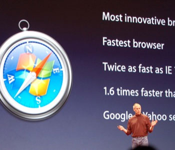
It’s also a great idea to discover a new browser every once in a while. Find out which one has features that best suit your taste. After all, Steve Jobs claims it’s twice as fast as Internet Explorer and 1.6 times as fast as Firefox.
Problem is, right after downloading and installing Safari for Windows I ran into two major problems right away.
Gibberish Text on Menus and Bold Text on Websites

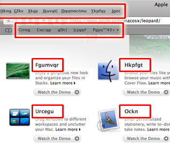
First thing I noticed was that all the titles on the menus and Bookmarks Bar were gibberish. I also noticed this on the Apple Start page and other pages which used the Lucida Grande typeface in bold.
It took me two tries to fix the problem based on suggestion at the Apple Forum for Safari 3 Public Beta for Windows. The first one involves renaming the Safari.resources folder Safari’s Program Files folder, running Safari ’til it crashes, rename it back, and re-running Safari:
This is what I did and it worked:
1. Copy the fonts from Safari.resources to windows
2. Delete the Safari.resources directory
3. Try starting Safari.. it won’t and will show the window of ‘reporting error to windows’.
4. Double click on the safari installer file and select the repair option.
5. Yippee!
However, this did not work for me. The second method, though, which requires renaming the Lucida Grande font file extentions in the Safari.resources folder, worked:
Have you all tried the solution I’ve seen elsewhere: rename the two *.ttf files in Safari.resources to *.ttf.1?
Source: Re: Safari 3 beta for Windows. Text is random letters. [cap included]
Blank Text on Websites

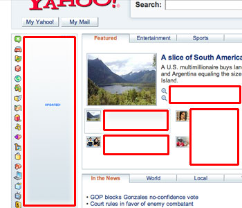
Another problem I encountered with Safari is that many web pages have blank text in them. This is most likely caused by having too many fonts installed and some missing keys in the program’s Fonts.plist file, which is located in the Application Data (hidden) folder. Adding the core fonts (like Verdana, Tahoma) to the file seems to bring things back to normal.
A Safari developer is also encourages us to upload our own .plist files so they look at the problem more carefully.
More First Impressions
It’s fast. No benchmarks here; Steve already showed that at the keynote. It just feels fast. Try GMail with it and you’ll be impressed. That’s how AJAX is supposed to work! (+2)
The fonts look weird. The larger and thicker words look like they were painted in watercolor and started to bleed on paper. Several others agree. I’m not too sure why the fonts on Safari render differently compared to other native Windows apps, but I can’t complain—read the next item. (-1)
Aqua? Apple has every right to incorporate its interface into Windows ports of their software, but is it fair? Macs almost always have a consistent look so why can’t they give in to the default Windows look? Probably ’cause we all want a piece of Mac goodness on our PCs (especially those who want to test how websites look across platforms!). But iTunes is a little more in sync with the Windows look, so they had better improve on that aspect. Despite all these, the dialog animations in Safari are a wee bit delightful. (0)
Auto-complete for URLs, but no other domain shortcuts. When I type in “i”, “imdb.com” appears. When I type in “google”, a .com is appended. This is a great anti-phishing feature. But, of course it can’t guess everything I’ll be typing in. I’d rather use the Ctrl+Enter, Shift+Enter, and Ctrl+Shift+Enter to automatically append .com, .net, and .org to addresses, as in Firefox and its cousins. (0)
Resizable text areas. Just like Netscape, you can resize text areas so you can see what you’re typing. (+0.5)
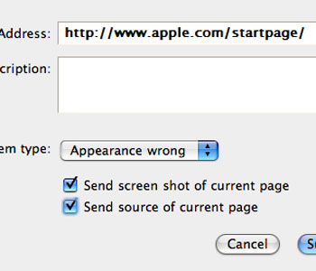
Helpful bug reporting features. Clicking on the bug icon brings up a bug report dialog which lets you describe the problem in detail, identify the type of bug, and even send a screenshot and page source to the developers. That can only be topped by quick improvements on the software, which I hope will happen. (+1)

Incomplete Tab Browsing and Middle Clicking. I’m used to the Firefox way of opening links that open in new windows are forced to open in new tabs. Safari doesn’t do that, and when you’re inside GMail, that gets annoying. Even a right-click on a link in an email leads to a new window. You can solve this by dragging the link to the tab bar, but who wants to do that? Moreover, I’d like to close tabs with my middle mouse button—it doesn’t help that the close button is on the left side (as it usually is on the Mac but not on Windows). (-1)
Firefox is still more intuitive. Download behavior is a little different: it’s sent to the Desktop (or some other location) by default, and you can only change this if you right-click and select “Download Linked File As…“. Generally speaking, you’ll finds lots more of those quirks, and you probably won’t ditch Firefox for that. (-2)
Feed reading looks nice. Safari displays feeds in a very friendly manner—much like Internet Explorer 7. Why Firefox can’t catch up I don’t know. But of these three, none carries more structure for advanced users, unlike Opera and Flock. (+1)
Overall score: 0.5.
The Verdict
Web developers and other techies will consider Safari on Windows this a must-have, especially with the release of the iPhone on June 29th, since the same Safari engine will be running on it.
For the rest of the world, give it a whirl—if you have the time and the system resources. Always be on the lookout for security threats, though.
Note that this is still a Beta. Expect lots of bugs, but also expect them to be fixed in due time.
Aside from the fairly obvious fact that Apple is aggressively expanding market shares for its products (I hope iChat is next!), it’s safe to say that the browser wars are back!
